IIAS' new visual identity
Dear reader, the new design you see here in this issue of The Newsletter is the first materialized outcome of a mental process that started at IIAS two years ago. Over time, we became increasingly dissatisfied with our visual identity; it was proving to be an inefficient way to communicate the institute’s core values to our readers. We had occasionally updated some colours and formats of our communication products, but in the long run it only resulted in an inconsistent image.
Only our beloved logo, the Chandrasa, which served us for twenty-five years, stayed more or less the same. It depicted a crescent-shaped ritual axe head from the Bronze Age, found in Southeast Asia. Albeit a strong, if not curious, shape - it never was very clear what it stood for and how it related to our institute. Is IIAS an archaeological or historical organisation? Does it only cover Southeast Asian topics? It was always difficult to explain. Another problem we faced was that our audiences often failed to recognise IIAS’ signature activities and projects, such as the International Convention of Asia Scholars (ICAS), the Urban Knowledge Network Asia (UKNA) or our review website newbooks.asia. There appeared to be a perceived gap between what we do and how we showed it.
Clearly, we faced a communication problem, which we could not solve ourselves anymore. We needed a new strategy that would help us to integrate all our communication efforts and to make our projects and activities better known and visible to our audience. We needed new ways to foster a sense of ownership among our partners (organisations and individuals), and to clearly show our identity as an open-minded, pioneering, inclusive and globally operating institute. To help solve our problem, we asked the Amsterdam/Beijing based creative agency Lava (www.lava.nl) to assist us in developing a new and effective communication strategy.
Creating a brand platform
Right at the start, the good people from Lava gave us, the IIAS staff, an inspiring lecture about branding. They confronted us with difficult, awkward – at times even existential – questions about who we are, why we do the things we do, and where we want to go from here. We learned that re-branding is more than a visual makeover, that it also entails the cultivation of a deep understanding of what it is we offer the world of Asian Studies; how we perform and what our convictions are; how people perceive us, where we interact with them and how we exchange ideas with them. To hold all these elements together we needed a strong, central notion.

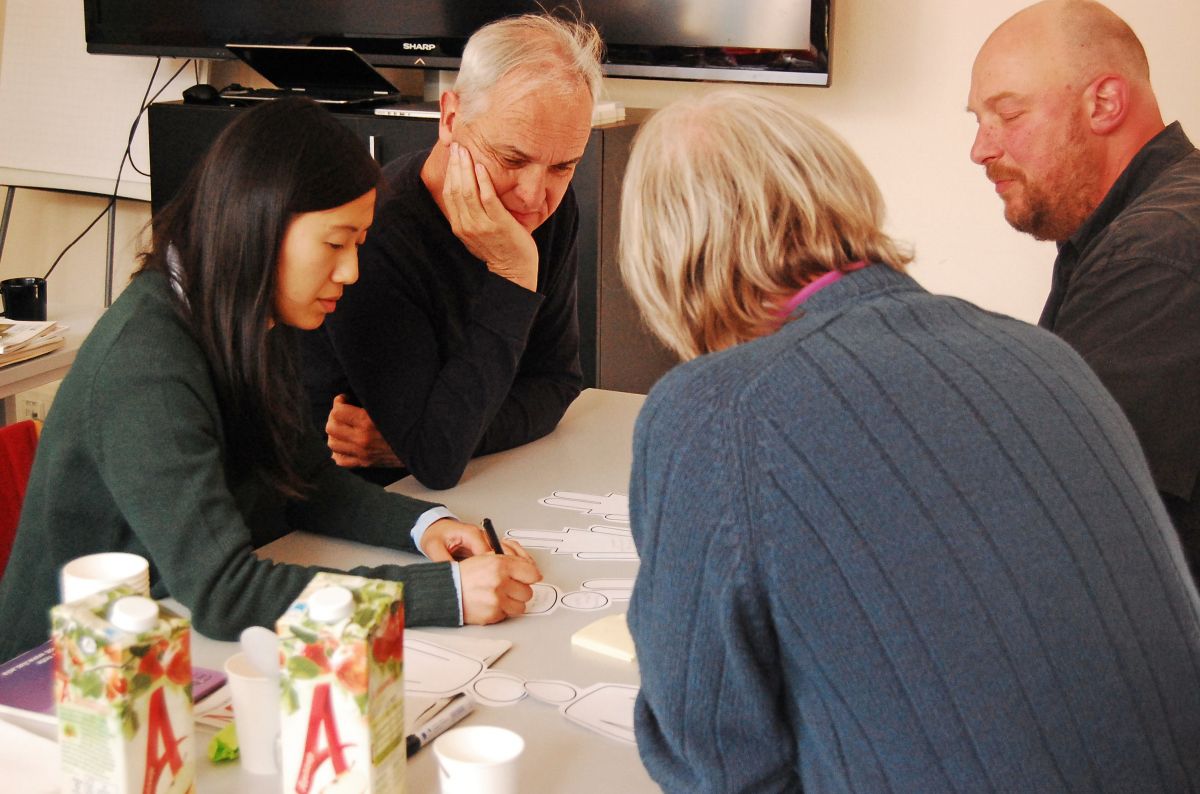
The designers from Lava proposed to build – in three phases – a solid brand platform, from which a new visual identity could be developed. In the first phase Lava’s strategist, Cecilia Martin, conducted some in-depth research. In this process she interviewed partners and colleagues of IIAS, investigated our strengths and weaknesses, and made a visual audit of existing organisations in the field of Asian Studies. These findings she took with her into phase two, in which she organised an inspiring creative workshop with IIAS staff. During this workshop all IIAS staff members had the opportunity to express their opinions about the tone of voice the institute should use in order to convey its key messages, and in which direction we should further develop our brand platform.


We discussed our position in the global academic landscape, about what makes us unique (broad audience beyond just academia, boundless research areas, extensive topics, inclusive of both scholars and practitioners) our core values (sharing, collaborative, transformative, pioneering) and the impact we want to make (builder, facilitator, initiator). Concluding our session, we formulated the tagline ‘Connecting peoples and knowledges’ as the central concept for our brand platform. Cecilia finalised phase two with a solid strategic document, serving as a guideline for the designers to develop our new visual identity.


Stackiness
In phase three, the Lava designers explored some ideas: should the designs reflect the connectedness of IIAS as a dot in a wider network of interlinked nodes, or as a dashed line connecting these elements? After some testing, we decided to conceptualise and visualise our core identity, as a research institute, with the practice of ‘carrying out research’.

Typically, when doing research your desk is cluttered with stacks of books, folders, photos, maps, memos, sticky notes, and other scribbled-upon pieces of paper lying around in some structured form of chaos. The designers used this image of stacked documents to develop a visual ecosystem for all our media products: layouts with information blocks overlapping each other. The stacking principle has also been applied to our new logo, and can be used in a wider brand architecture, with current and future projects having their own look and feel, while maintaining a direct visual reference to IIAS.


In 2018 you will see the new designs gradually permeating through our media channels, from the Newsletter to our brochures and posters and thereby ultimately also synchronising our digital services. But first the Newsletter. We hope the new design will make reading it even more pleasurable. Do let us know what you think of it by sending an email to: t.j.h.voorter@iias.nl
With special thanks to the Lava team: Noortje Boer, Daan Hornstra, Anton Lamberg, Cecilia Martin and Frank Smolenaers